Lab 10: Multimedia II: Creating Website Graphics
Using GIMP to create original graphics for the web.
Pre-lab
None
In-lab
Website Banner Graphics
You and your partner will create a banner graphic that can be used in different ways on a website.
First, it can be used as a stand-alone image with or without a background color:
PNG file with transparent background:

JPG file with solid background color:

Second, we can use a technique called "image replacement," where we can replace an h1 or
h2 header using a background image.
PNG file over default (white) background
Eric & Darren
<h1 style="
  background: url(banner.png) no-repeat left center;
  background-size: 400px 75px;
  text-indent: -9999px;">
    Eric & Darren
</h1>
PNG file with CSS controlled background color
Eric & Darren
<h2 style="
  background: yellow url(banner.png) no-repeat left center;
  background-size: 400px 75px;
  text-indent: -9999px;">
    Eric & Darren
</h2>
The technique above is useful because the text "Eric & Darren" still
appears in the document, which helps with Search Engine Optimization (SEO),
but we can use the power of a graphics program like GIMP to change the
appearance of an h1 or h2.
Task
- Open Gimp
- Create a new graphic:
On the top menu, selectFile → New... - Set the graphic size:
Enter Width: 800px and Height: 150px
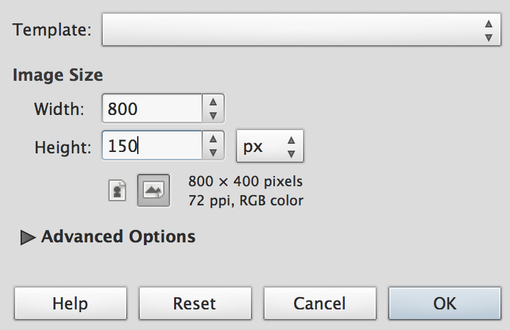
- Click OK and your graphic should look like this:

- Save your graphic as banner.xcf in your lab10 folder.
- XCF is Gimp's own file format, which stores every bit of information needed to edit the graphic. This format creates a large file size that is not appropriate for web pages.
- Make sure the Toolbox is visible. It should have icons that look
like this:
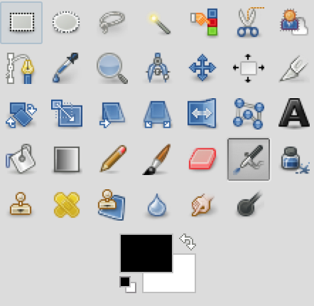
If it is not visible, selectWindow → New Toolboxon the top menu. - Change the graphics' background color:
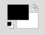
- First, click the foreground color selector:
- Second, experiment with the color selectors and pick an interesting color:
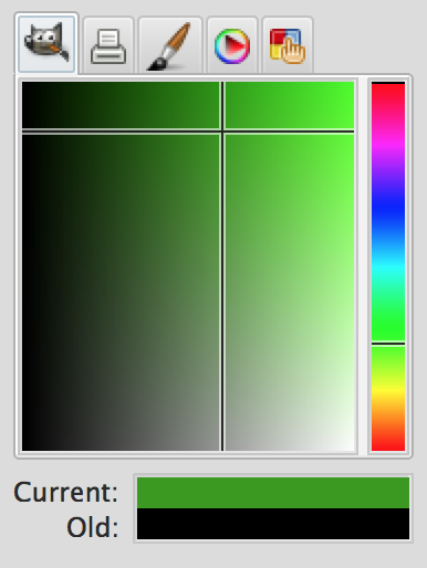
- In the example above, I picked a color that reminds me of lima beans. Notice that when you pick a color, you can view the values that generated the color including the HTML hexadecimal value:
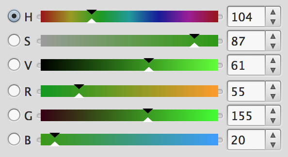
- RGB stands for red, green and blue.
- HSV stands for hue, saturation, and value. Hue refers to the actual color, saturation controls the "deepness" (vivid vs. grayish) and value controls the lightness or darkness.
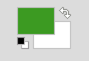
- Once you picked a color, click OK and the color you picked should be displayed as follows:
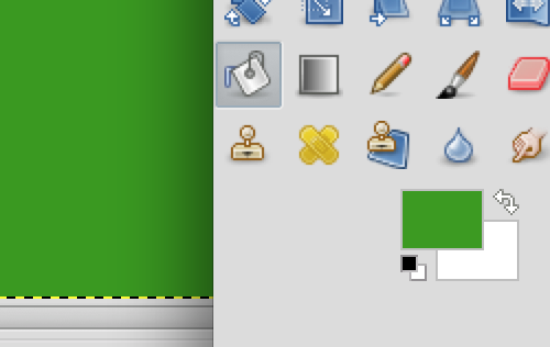
- Click the bucket tool
 and then click on the white background color of your graphic. The color of
the graphic should change:
- First, click the foreground color selector:
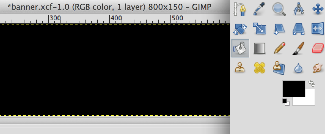
- Use the technique you just learned to change the background color of your graphic to black. Make sure
you use the darkest black, which is hexadecimal color #000000:
- Adding Text In this next part we will add white text with your name and your partner's name on the black background:
- Be sure the Tool Options panel is visible:
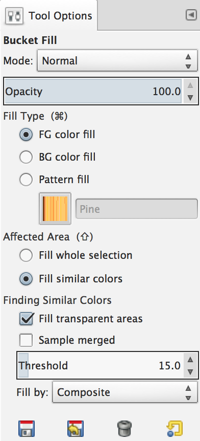
If it is not visible, selectWindow → Dockable Dialogs → Tool Optionson the top menu. - Select the Text Tool:

- In the Tool Options area, pick a font that you like. Scroll down to see all the fonts:
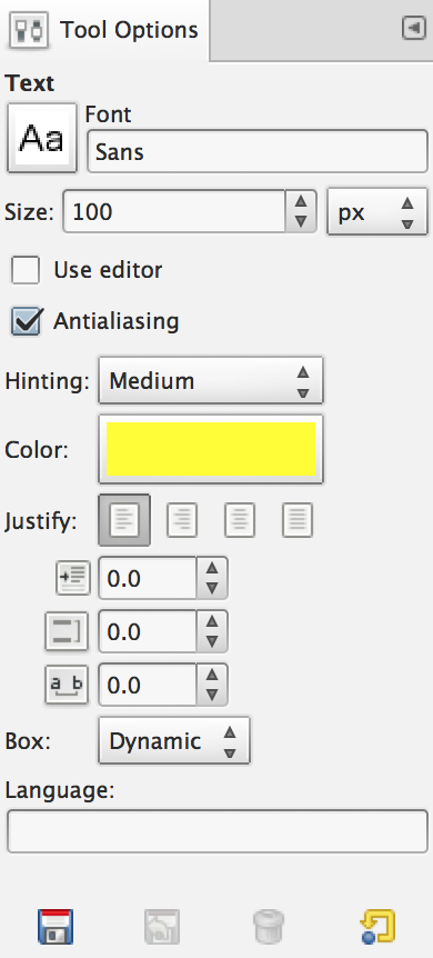
I choose a boring font to match my personality. - Change the font size to a value greater than 60
- Make sure the font color is white or a very bright color. While I picked yellow, we will eventually replace this color with a pattern and then use the letters to create a mask. This process works best if there is great contrast between the letters and the background color. Black and white have the most contrast.
- Then, making sure the Text Tool
 is selected, click near the top left corner of the black graphic and type your name and your partner's name:

My name is Eric and my imaginary partner is Darren. Darren is my imaginary lab partner, not my imaginary life partner. Anyway, write your name not mine, and definitely do not write Darren, unless your name or your partner's name is Darren.
- Be sure the Tool Options panel is visible:
- Adding a Blur:
- Make sure the Layers Tab is visible (
Window → Dockable Dialogs → Layers), right click on the text layer and select New from Visible:
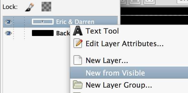
This creates a new layer based on the visible area of the text. - Notice that there is now a new layer with a white border.
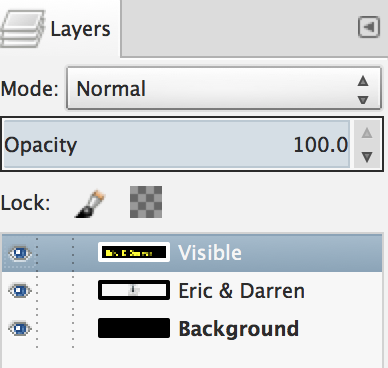
This indicates that this layer is currently active, so that any operations we perform will apply to this layer. - Apply a blur to this layer, by selecting
Filter → Blur → Gaussian Blurfrom the top menu:
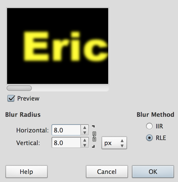
Change the blur level to 20 to see the impact it can have. But, then use a level between 5 and 8 so the text remains very readable.
- Make sure the Layers Tab is visible (
- Adding Filters:
- In the Layers Tab, right click on the visible layer and select New Layer...:
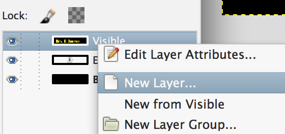
- Make sure you select Fill Type white:
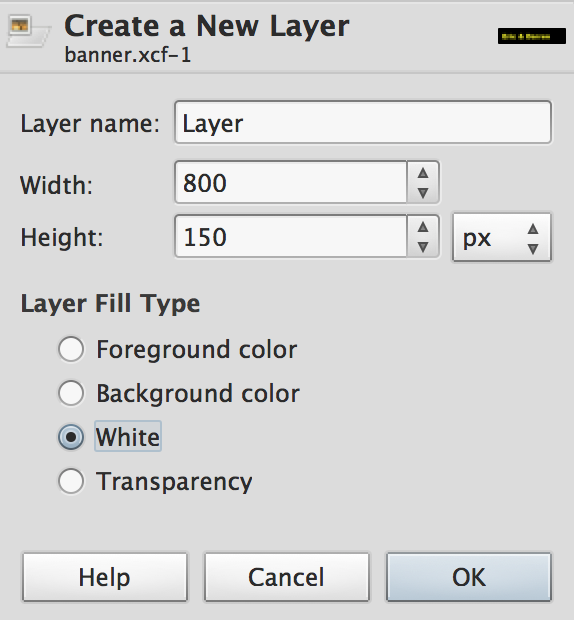
This creates a new layer based on the visible area of the text. - This new layer will entirely cover the blurred text with a white background. Next, we will apply two filters. The first will add an interesting colorful pattern and the second will allow the text to "bump out" of the colorful pattern.
- Select
Filter → Render → Clouds → Plasmafrom the top menu:
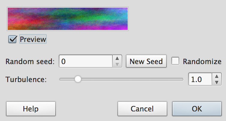
Use the default values. - Select
Filter → Map → Bump Mapfrom the top menu:

On the Bump Map drop-down menu, select the "Visible Layer"
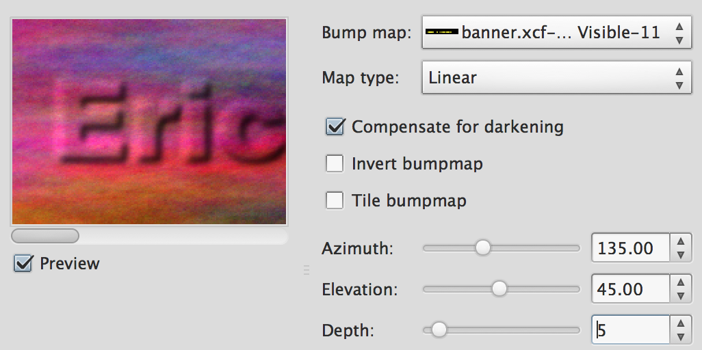
Experiment with differentDepthlevels to control how much the text layer "bumps out"
- In the Layers Tab, right click on the visible layer and select New Layer...:
- Masking: In the next section, we are going to add something called a "Layer Mask," which is
one of the most useful but difficult to understand concepts in graphic editing.
- Select
Layer → Mask → Add Layer Mask..from the top menu:
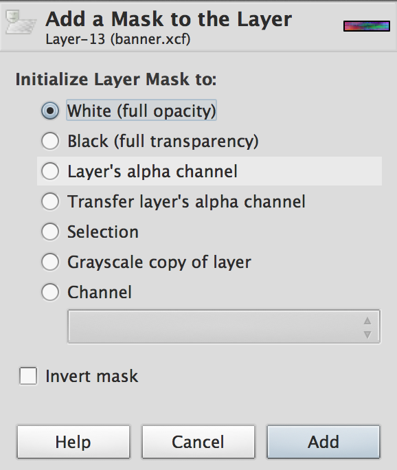
SelectWhite (full opacity)and click Add.
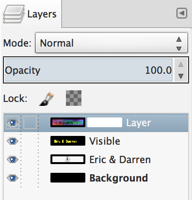
This should add a white rectangle to the topmost layer (see above) - Next, we are going to copy the “Visible” layer, and paste it into the layer mask of the colorful plasma layer.
- First, click on the “Visible” layer in the Layer Tab:
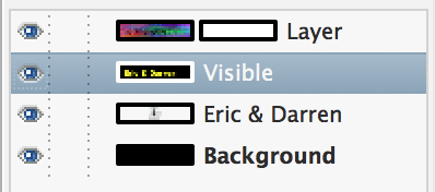
- Second, select
Edit → Copyfrom the top menu. - Third, click on the topmost layer, i.e., the colorful layer with the mask and select
Edit → Pastefrom the top menu. - This will add yet another layer to your graphic:
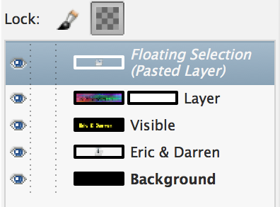
- Finally, select
Layer → Anchor Layerfrom the top menu. - At this point, your graphic should look something like this:

- Select
- Background Color Layer: Next, we are going to add an additional background layer that we can change, so this graphic can
be further customized for different websites.
- Change the foreground color to a color you like:
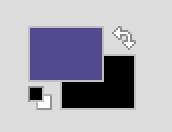
I picked a shade of purple that reminds of the Niagara Purple Eagles and the joy I felt watching Siena beat this silly team twice. WTF is a Purple Eagle anyway. - In the Layer Tab, right-click on the visible layer and select New Layer...:
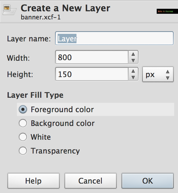
Select Foreground color so this new layer will match the color you previously selected. - What is awesome is that you can use the Paint Bucket Tool to recolor this layer if you ever want to change this graphic to match your website colors.
- Change the foreground color to a color you like:
- Color Levels: Next, we are going to mess around with the color levels to make the graphic look sharper, i.e., more crisp. We actually used a Gaussian blur to make the text appear rounded, but this blur also makes the edges look too blurry.
- In the Layer Tab, click on the mask of the colorful layer, i.e., the right rectangle of the topmost layer:
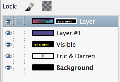
- Select
Colors → Levelsfrom the top menu. - Set the Input Levels to 0.5 and 100 as shown below:
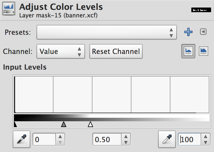
This maps the lighter colors to darker shades, which helps to make the edges look crisper - Here is what the image should look like now:

- In the Layer Tab, click on the mask of the colorful layer, i.e., the right rectangle of the topmost layer:
- The final improvement we are going to make is to add a drop shadow. Drop Shadows serve two purposes. First, they help create the illusion
of depth. The shadow makes it appear that the letters are hovering over the surface and the light
is casting a shadow on the background. Second, and more importantly, they help to better
distinguish the edge of the letters on a background that would otherwise blend into the colorful pattern of the letters. This will allow this graphic to be placed on a wider range of background colors and shades.
- In the Layer Tab, right-click on the Visible layer and select
Duplicate Layer:
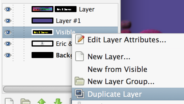
- This creates a new layer called "Visible copy" which has a copy of the text.
- Move this new layer by dragging it in the Layer Tab:
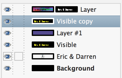
Make sure you move it above Layer #1 but below the topmost mask layer. This will allow the drop shadow to be above the colored background, but beneath the mask that creates the text effect. - Make sure the "Visible copy" layer is selected
- Select
Colors → Desaturate...from the top menu.
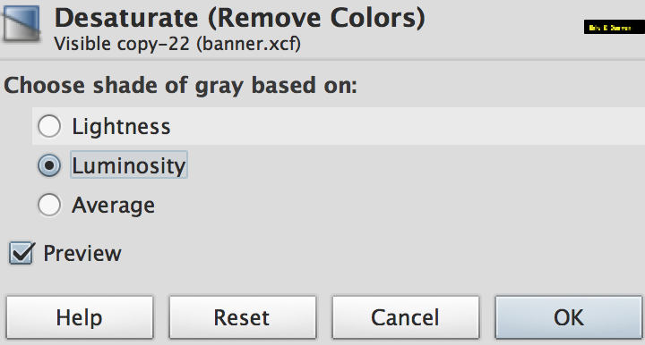
Be sure to select Luminosity and the click OK. This removes all the color (if any) from the text. - Select
Colors → Invertfrom the top menu.
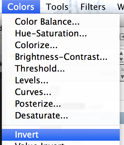
This makes the text black. - Select
Layers → Transparency → Color to Alphafrom the top menu. This makes the text partially transparent so you can see the background color near the edges (transparent blur). - In the Layer Tab, make sure the "Visible copy" is selected.
- In the Toolbox, select the Move Tool
 and then click on the graphic and use the arrow keys to move the drop shadow you
just created. Keep pressing the right and bottom arrow keys and move the drop
shadow until the graphic looks something like this:

- In the Layer Tab, right-click on the Visible layer and select
- Export the image
File → Export...as banner.jpg (use a quality value of 90) - In the Layer Tab, click the Eye Icon
 to deselect/hide all of the layers except for the top two:
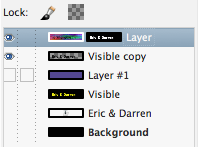
Note that the top layer is the colorful text, the second layer is the shadow and the third layer is the background color. The bottom three layers were used to generate the colorful text. With only the top two layers visible, the graphic looks like this:

- Export the image
File → Export...as banner.png (use compression level 9). Be sure to specify PNG by typing .png for the file extension. Use the settings shown below:
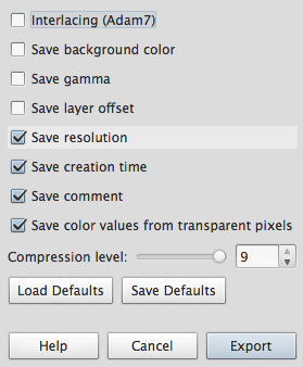
The PNG (Portable Network Graphic) format allows a graphic to have different levels of transparency. - In your lab10 folder, create a new web page called lab10.html with the basic HTML5
required markup and then add the following code:
<h2 style="
  background: yellow url(banner.png) no-repeat left center;
  background-size: 400px 75px;
  text-indent: -9999px;">
    Insert Your Name Here
</h2>
Notice that we are using CSS to give theh2both a background color of yellow and a background image. To hide the actual text content, we are using a very large negative indent, which moves the text off the page. - In the inline CSS code that you just added, change the background color from yellow to something different. Experiment with different 3-digit hexadecimal codes, i.e., #RBG where R, G and B are the levels of red, green and blue respectively and the value can range from 1-9 or A-F.
On Your Own
- If time permits, repeat the process you just followed (don't worry it will go much faster the 2nd and 3rd time) to create individual banner graphics for you and your partner.
- You can use just your name or a longer title like "Michael John's Website".
- Save the file as banner_yourname.xcf so you do not overwrite your lab work, which must be submitted. This work will be included in project4 and does not need to be submitted yet.
- In part #12 (Adding a Filter), you can experiment with different Rendering Filters. The Plasma Cloud filter may be too colorful for your website.
- Export two versions of your banner graphic.
- One version will be .jpg format and will have a colored background layer, which can be used as a stand-alone image.
- The other version will be .png and will have the background layer hidden, so the text is transparent. This allows you to overlay the image on a CSS decorated background.
Deliverables
Create a zip file for your lab10 folder, which should include: banner.xcf, banner.jpg, banner.png and lab10.html
Upload lab10.zip to Blackboard.