Lab 8: CSS Design Techniques
Goals
Learn about common CSS styling techniques including
- Positioning and styling of images.
- Positioning and styling of text containers.
- Positioning and styling of navigation menus
Key Concept
CSS truly enables designers to change every aspect of an HTML elements appearance. Simple ordered lists can become navigation tabs or drop-down menus. Images and containers for text can be positioned and decorated in very robust ways.
1. Page Styling
- Download person.jpg, lab8.html and lab8.css to your lab8 folder.
- Examine lab8.html in a browser and Notepad++.
- Open lab8.css in Notepad++ and
then add the following styles:
body { background: black; } article { background: white; margin: auto; width: 600px; } - Notice how the text is too close to the black background? Fix this problem using the proper CSS property. Ask if you are not sure how to fix this.
- Change the body background color to gray and then add a 1 pixel solid black boarder to the article.
- Add a box-shadow to the article with the following values: 10px 10px 0px black;
- Notice how the shadow is just solid black. Change the box-shadow so that it blurs.
- Visit the Background Pattern Website and design your own tiling background pattern.
- Download your pattern and save it to your lab8 folder as bg.png.
- Change the CSS of the body to:
background: gray url(bg.png); - Note that if the background image cannot be displayed then the background color will default to gray.
- Your finished page design should look something like this:

2. Image Styling
- In lab8.html notice that there is an image tag wrapped in a photo div (i.e.,
div class="photo"). - In lab8.css use CSS to make the photo div float right.
- If you did it correctly the image will no longer be between two paragraphs. Instead, the image will be aligned to the right and the paragraph text should flow around it to the left.
- Notice that the main text is very close to the image. Give the photo div margin so the text never gets within 10px of the image.
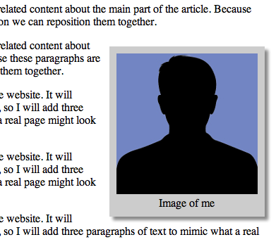
- Use CSS to decorate the photo div by giving it a background color, padding, and a box-shadow. Also, center the text and set the margin of the paragraph inside the photo div to be zero, so the caption will be compact and centered.
- Your finished image should look something like this:
- Download, border.png to your lab8 folder.
- In lab8.css, give the photo div a border-width of 25px.
- Add
the following border image code:
border-image: url(border.png) 25 25 stretch; - Your finished image should look something like this:
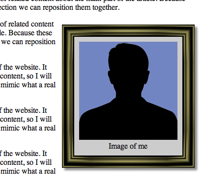
- Finally, find your own border image by doing a Google image search on the key phrase "picture frame border image"
- Download your image to your lab8 folder and change your CSS to use your downloaded border image.
- Note that you may have to change the width parameters so your border renders properly. The border image I selected had a width of 25px.
- Show your instructor your work.
3. Text Container Positioning
- To better understand how each text container is positioned, add a colored border and colored text as follows:
header, footer { border: 1px solid red; color: red; } #main { border: 1px solid blue; color: blue; } - Using the code above as a model, make the #ads section green and #related section purple.
- Your finished page should look something like this:
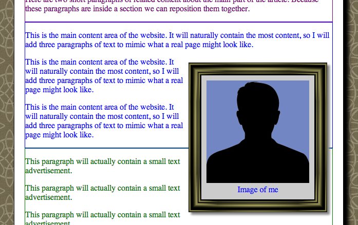
- Notice how the floating image hovers over the colored borders. This will not look good if we add decorative borders to these text containers.
- In lab8.css, add the property
overflow: autoto the #main section. This will resize the height of this text container so that in will encapsulate the floating image. Warning: If this section had an explicit height, scroll bars would be created instead of resizing the section. - Save lab8.html and lab8.css, and reload lab8.html in a web browser
- Notice that the blue border now wraps around the floating image.
- Also, notice that the first paragraph of the #main section is rendered above the image and that there is not enough text to fill the rest of the text container. This is because the photo div is defined below the first paragraph. Thus, the first paragraph get rendered before the image can be rendered.
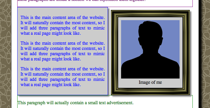
- Move the photo div so that it is outside the #main section, i.e., it is in-between the #related section and #main section.
- Add the following CSS to the #main section:
	background-color: #ccc;
	padding: 10px;
	text-align: justify;
	box-shadow: 5px 5px 5px #888;
- Save lab8.html and lab8.css, and reload lab8.html in a web browser
- Your finished page should look something like this:
- Move the photo div so that it remains inside the #main div but comes before the first paragraph.
- Save lab8.html and lab8.css, and reload lab8.html in a web browser
- Your finished page should look something like this:
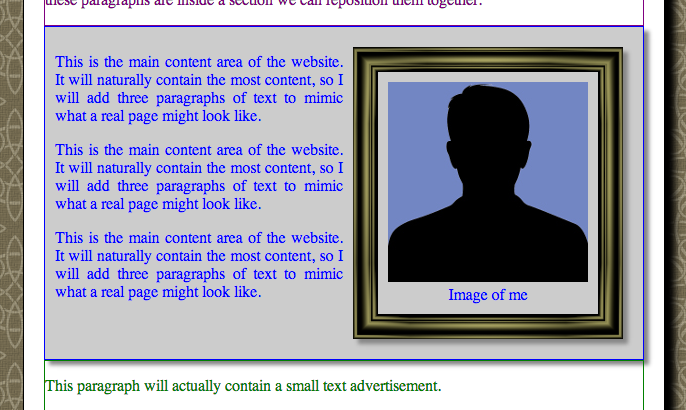
- The design above treats the image as if it is part of the main section, so the border get drawn around it.
- Using the concepts that you have learn, try to make your page look like this:
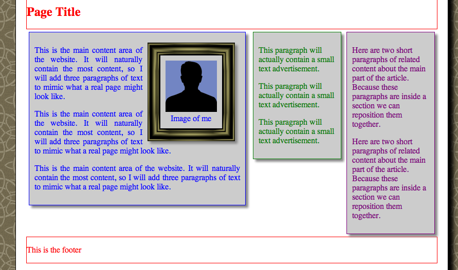
- Hints: Resize the article to 800px to make room for the horizontal layout; Give the #main section
a width of 400px; Float the #related and #ads sections to the right and give them each widths of 150px. Give the #related and #ads sections padding and margin so they separate and so the text isn't too close to the border edge; Make the footer
clear: bothso that the footer renders below the containers that are floating right and floating left.
4. Navigation Menu Formatting
- Examine the navigation menu at the top of lab8.html. Notice that it is marked-up as an unordered list.
- To remove the list formatting, add the following CSS code to lab8.css:
nav ul, nav li { padding: 0; margin: 0; } nav li { list-style: none; } - To understand the positioning of the hyperlinks, add the following CSS code:
nav a { border: 1px solid orange; }. Notice that this CSS only changes hyperlinks in the nav. - In the next few steps we will transform the top area of the website to look like this:

- Make the nav hyperlinks larger buttons by making
them
display: blockwith aheight: 32pxandpadding: 5px 25px;. Also, make the top right and top left borders round:
	border-top-left-radius:1em;
	border-top-right-radius:1em;
nav a { // Insert you code here } - Make each list item
float: left;nav li { // Insert you code here } - Make the nav ul
overflow: hidden;and give itheight: 32px;andbackground-color: gray;nav ul { // Insert you code here } - Give the header h1
padding-top: 20px;andtext-align: center;header h1{ // Insert you code here } - Give the header h2
background-color: white;,padding: 20px;andmargin: 0px;header h2{ // Insert you code here } - Give each nav a white background and change the border color to black.
- Give the header a gray background and rounded top left and top right borders.
- Show your instructor your final design.
Deliverables
Upload lab8.css to Blackboard.