Project 3: Decorating Website With CSS
Overview & Deliverables
Starting with the files you created in project 2, clean up your HTML so that all your pages have a consistent look and feel that better integrates the main navigation menu on all web pages. All your web pages should use a linked a central style sheet that includes rich styles to make your page look unique and interesting, but still functional and readable. See schedule for due dates. Create a zip file of your project folder and submit via Blackboard.
Getting Started
Create a folder called project3 and copy all the files you created from project2 to you new folder.
1. Linked Stylesheet (5 points)
If you haven't done so already: All of your pages (even your individual photo pages) should use the same linked stylesheet. In the head use the link tag to properly link a stylesheet called index.css which we will call your "central stylesheet."
Your central stylesheet should include the project2 styles that were used to transform you navigation menu into a horizontal drop down menu. The central stylesheet should also be used to define styles for every tag that you use on your website.
2. Page Containers (10 points)
To format your pages, all of your content should be organized into a meaningful containers. Here are two examples:
Article Model
Think of each page as an article with a header, footer, and one or more sections.
<body>
	<article id="page">

		<header>
		</header>

		<section id="info">
		</section>

		<section id="bio">
		</section>

		<section id="goals">
		</section>

		<footer>
		</footer>

	</article>
</body>
Generic Model
Use div tags instead of article and sections
<body>
<div id="page">

	<header>
	</header>

	<div id="info">
	</div>

	<div id="bio">
	</div>

	<div id="goals">
	</div>

	<footer>
	</footer>

</div>
</body>
3. Page Decoration (15 points)
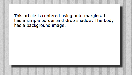
Use CSS to decorate your main article or div so that it is a centered 900px wide page with a decorative border (border image or drop shadow). The main page should be centered with respect to the body and the body should use a dark background pattern. See example:

4. Consistent Headers (10 points)
With the exception of your homepage (project3/index.html), all your pages should have a consistent header tag that includes your navigation menu and consistent website and web page titles.
Use the following template.
<header>
<h1>Website Title</h1>
<nav>
Here is your navigation menu
</nav>
<h2>Web Page Title</h2>
<h3>Optional Sub-titles</h3>
</header>
Notice that this header may be different than what you did for project 1 and 2. Once you start to flesh-out the pages on a website, it is common to re-think your h's (i.e., h1, h2, h3, etc.), i.e., where they are positioned and which words are really the most important.
The template above represents a search engine optimization (SEO) dilemma. Is your Website Title (h1) more important than your Web Page Title (h2)? The Web Page Title uniquely describes each page which is better for indexing each individual page, whereas your Website Title describes many pages and is less specific to the page. However, consider what happens when you have Sub-titles that are even more specific than the Web Page Title.
Here are two examples:
<header>
<h1>Eric Breimer's Website</h1>
<nav>
Here is your navigation menu
</nav>
<h2>HTML Examples</h2>
<h3>Table</h3>
</header>
<header>
<h1>Eric Breimer's Website</h1>
<nav>
Here is your navigation menu
</nav>
<h2>HTML Examples</h2>
<h3>Form</h3>
</header>
Consider that your Table and Form pages are both examples of HTML coding. Technically, the words "Table" and "From" are the most unique in terms of identifying the pages (Table Example vs. Form Example). However, these words could refer to non-HTML things like an actual wooden table or a paper from.
Instead of thinking about which words are the most specific relative to your web pages, think of which words are the most important in terms of identifying your web pages on the Internet via a Google search. There are many web pages about tables and HTML examples, but there may only be one HTML Table Example page by Eric Breimer. There is no right or wrong answer. But, the examples above, illustrate my intention to emphasize that my name is more important than the fact that this is an HTML Example. Similarly, HTML Example is more important than the word "Table." If my website was devoted to HTML Examples, my name would not be as important and I would make "HTML Examples" the h1. Similarly, if my website was devoted to tables, I would make "Table" the h1.
Because your website is about you, use the template and examples above and re-do your h's to really reflect what each page is all about. All you pages should now have a consistent h1 (Website Title) and h2 (Web Page Title).
5. Formatting Website Title and Navigation (10 points)
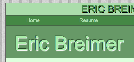
Use CSS to decorate your Website Title (h1 inside of header) and your Navigation Menu so they match the width of your page layout and so the colors coordinate. Use CSS styles (color, font, size, shadow, centering) to make the Website Title stand out. Change the CSS of navigation hyperlinks (nav ul a) so they span across the entire page width and they use colors and fonts that match your Website Title. Matching your Website Title and Navigation Menu helps to connect these elements so users understand that they are part of every page on the website.
Below is an example:

6. Unique Homepage Title (5 points)
Your homepage is the one page that does not have have a consistent header. In fact, you must use this example:
<header>
<h1>Eric Breimer's Website</h1>
<nav>
Here is your navigation menu
</nav>
<h1>Eric Breimer</h1>
<h3>CS Major</h3>
<h2>Siena College</h2>
</header>
Technically, the title of the page should be something like "Home Page." However, "Home Page" does nothing for search engine optimization because every website has a "Home Page." Instead, you must use h1 to again emphasize your name. However, we do not want this h1 to look like the Website Title which is right above the navigation menu. This is a perfect opportunity to use inline CSS to make the 2nd h1 the most distinctive thing on the website.
Use color, font-size and text-shadow to make your name the most distinctive text on the page.
Below is an example:

7. Floating An Image (5 points)
Your homepage should include an embedded image (a picture of you or a picture that represents you in some way). The picture should float to the right with proper margins so that the text content on the page flows around the image. Rather than float the image, you will embed the image inside of a fixed width div that matches the width of the image (200px or less) and then float the div. The div should be decorated with border styles.
8. Two Column Layout (10 points)
Your course list page should have two columns. The column on the left should be courses by semester/year and the column on the right should be courses by subject area. You should use logical divs or sections that have fixed width (400px or less) and plenty of margin or padding so the content remains readable. Use CSS to give your divs or sections attractive borders that match the overall style of your header area. Since this may be the only page that has this type of two column design, this is a perfect opportunity to use embedded CSS. Instead of adding the CSS to your central stylesheet. You can define a style tag inside your head and directly embed your CSS in your courses.html file.
9. Consistent, Unique, and Functional Design (20 points)
HTML elements should be used consistently on all your pages and all HTML elements should demonstrate some unique styles that are defined in your central stylesheet. Use colors, font-types, font-sizes, borders and backgrounds to make your site look unique, but make sure the content remains readable.
10. Overall Quality of Content (10 points)
This is an opportunity for you to add, correct, and enhance the content of your emerging website. Points (1-10) will be given based on the quantity and quality of your content.